Showing posts with label comparison. Show all posts

Tuesday, 25 November 2014

THREE La Teinte des Bijouxxx Collection for Holiday 2014


Today I'm excited to showcase THREE's holiday 2014 collection: La Teinte des Bijouxxx. It's a small collection with two sets of Shimmering Color Veil loose pigment trios. The final gift set in the collection is a three piece brush set.


Picture heavy post!


The pigment sets are housed in a simple, sleek but rather mediocre black satin box, though I'm personally happy with the lack of tacky peripherals you often find with the Japanese holiday coffrets (they try very hard to out tackify each other year on year!). The pigment tubs are very basic see through screw cap containers, each containing 0.9g of product. Do note that the net weight of the permanent lineup is 1.7g, almost double that of a single in the set, and that packaging slightly more elaborate. On net weight alone, I think you get a better deal with the permanent line up as it’s almost double the amount, but not more than double the price. However, there is an exclusive shade in each set, so it really comes down to whether you love the LE shades.


The brush set contains three weasel and horse hair brushes; a Blend In Brush Round (LE travel size), a Color Veil Brush SS (LE travel size), and an exclusive Color Veil Brush XM, as well as the exclusive black makeup pouch. They’re all flat paddle type brushes that work well with these pigments. As much as I wanted to take all three sets home, I passed on the brush set since I plan on getting the Nars holiday brush set and maybe one of the MAC ones.


Here’s a closer look at each shade by set, and some stash comparisons. You can also check out a small clip of these sparkling goodies in my IG here. To save my sanity, I've not compared them to pan based powders or liquids, though in hindsight I should have compared with a few of the Etude House Play 101 pencils (reviewed here).


Shimmering Color Veil Bijoux Box 1 contains:
Ice Blink #29 - a soft feathery snowy white with diamante effect micro glitter.
Pink Topaz Gisele #X02 (LE) - a mauve pink with pink, purple and gold micro glitter. The glitters here are the largest flecks in this set.
333 Dreamers #38 - a "deep purple that almost looks gray" with skyblue, purple, pink and silver micro glitter.

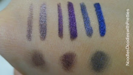
Box 1 = bottom row swatch

Even when swatching on the back of my hand, I had difficulty with Ice Blink. It’s either too ‘feathery’ and clumpy or it’s barely there at all. A flat paddle brush doesn’t help, and I have better luck patting it on with fingers. Under good indoor lighting the glitters are very pretty, very fitting to its name. Nonetheless, this one was my least favourite by far.


Pink Topaz Gisele and 333 Dreamers are exquisite. They apply great with a paddle brush and can be blended without disappearing. They are very complimentary to each other, and this set was what used on the model for the promotional pictures.


Some stash comparisons:


a. Ice Blink
b. Dior Fusion Mono in Lune #001
c. RMK Ingenious Cream & Powder Eyes in Silver Gold #01 (LE)
The Dior is much more metallic and silver, while the RMK has pink tones.


a. Pink Topaz Gisele (LE)
b. Chanel Illusion d'Ombre in New Moon #97 (LE)
c. MUFE Aqua Cream in 17
The Chanel has much more gold and silver hues, the MUFE is close in colour very little sparkle effect.


a. 333 Dreamers
b. Chanel Illusion d'Ombre in Diapason #92
c. RMK Ingenious Cream & Powder Eyes in Purple #03 (LE)
d. Armani ETK Silk in #33
e. Armani ETK Silk in #3
No real close comparisons here, 333 Dreamer is much more grey.


Shimmering Color Veil Bijoux Box 2 contains:
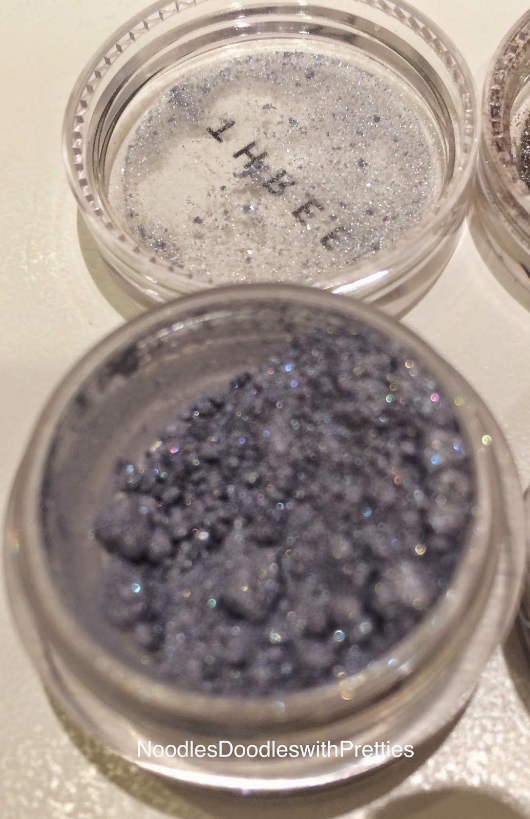
Wild is the Wind #33 - a “grace blue that shines like light reflecting on water” with pink and blue micro glitter.
Black Diamond Iris #X03 (LE) - stormy black grey that leans purple with a rainbow of micro glitters.
Shadowland #35 - a “brown color that is reminiscent of cocoa powder” with gold pink and green micro glitters.  

Box 2 = top row swatch

The colours in Set 2 reminds of me this year's Chanel holiday eye palette and I'm far more impressed with these than Chanel's mediocre performer. I don’t really agree with the official description of Shadowland, it’s more of a muted mustard gold to me and I don’t really see the green in there. All three pigments give me spectacular performance, and Shadowland is deceivingly pigmented, so a tiny bit goes a long way.


Some stash comparisons:


a. Wild is the Wind
b. Armani ETK Silk in #10
c. Armani ETK Silk in #35
Both the ETKs are much more silver.


a. Black Diamond Iris (LE)
b. NYX Roll On Shimmer in Onyx #04
c. Armani ETK Silk in #4
d. Dior Fusion Mono in Cosmos #281
e. Dior Fusion Mono in Aventure #081
Black Diamond Iris leans more purple than the other which are grey/black/blue based.


a. Shadowland
b. NYX Roll On Shimmer in Walnut #16
c. NYX Roll On Shimmer in Almond #11
d. MUFE Aqua Cream in #15
Shadowland probably lies in the middle of the two NYXs in terms of colour, and the MUFA is quite close in colour, but has no glitter effect.


The texture of all of them are super super fine and almost wet to the touch. Indeed the main reason I didn't get the more affordable MAC Heirloom pigment sets was because they came with pigments that was purely glitter, and big pieces at that. Would not be very fun with those piece falling into the eyes. Using a paddle brush I am able to get intense colour with all except one of the pigments (Ice Blink), thus it's possible to use these as an eyeliner.


Lasting power is about ten-ish hours on me, after which it starts dulling and the colour fades a bit. There's very minimal fallout, and certainly if I blended a bit under the lower lashes, it more or less 'hides' any fallout. Have not needed to use a primer or spritz my brushes with fixing spray. One observation made trying to hand swatch for photos, they didn't perform as well on the back of my hands, which is quite dry, so those with drier eye lids will want to use something to help adherence.


A note about the NYX Roll Ons, they’re really amazing for the price and in person, they are pretty good dupes of the Color Veils. However, they do tend to fall out, so some type of fixing spray is a must, and they blend away to nothing very easily, so dabbing is my perferred way to apply them.


Below are my first try’s with each set. Look 3 was my failed attempt to recreate the promotional picture, before remembering to check their website for the tutorial (in Japanese only)
Look 1: using Shimmering Color Veil Bijoux Box 2

Black Diamond Iris unblended

Black Diamond Iris blended towards crease, Wild is the Wind blended in inner third, Shadowland blended in socket line and brow bone area

Look 2: using Shimmering Color Veil Bijoux Box 1
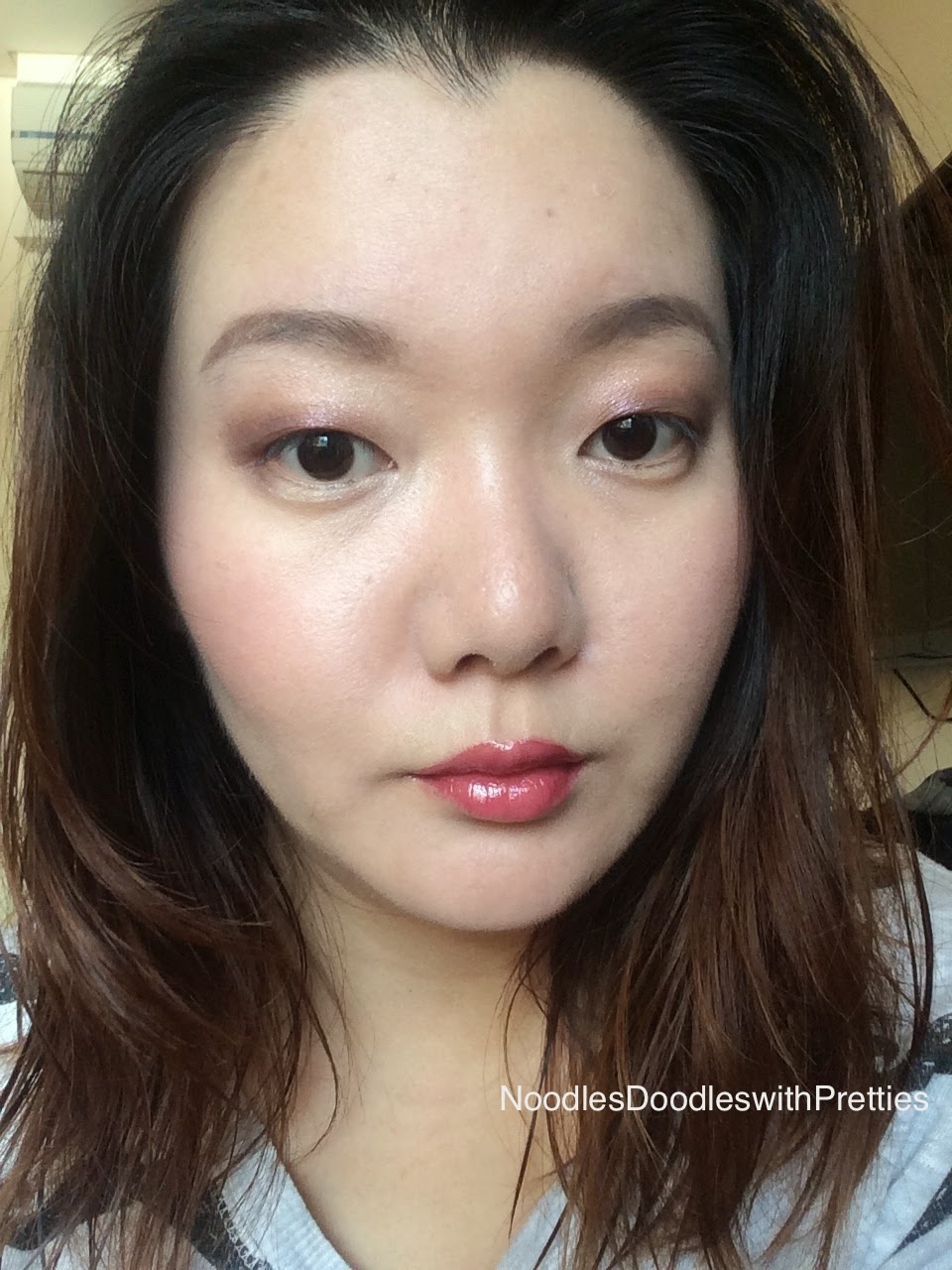

Pink Topaz Gisele as blended liner, 333 Dreamers in outer third, Ice Blink in inner corner and brow bone area
Look 3: using Box 1 and Shadowland


PTG unblended

PTG blended upward towards crease into Shadowland, Ice Blink in inner corners and brow area

Other things used:
Mikimoto Essence Liquid Foundation in OC03 or Bobbi Brown Foundation Stick in 2
Chantecaille Compact Makeup in Shell
MUFE Full Cover concealer in #6 for spots
Chantecaille Le Camouflage Stylo in 2 or Diorskin Star concealer in 001 for under eye
THREE Color Veil for Cheeks in Wind Swept Love #16
THREE Flash Performance Eyeliners in Eye Belong #04 (Look 3) & Eye Rock #05 (Look 1)
Shu Uemura Brow Pencil Hard Formula 9 in Seal Brown 02
YSL Gloss Volupte in 106 in Look
Cle de Peau Shimmering Lip Gloss in #1 from the Holiday 2014 lip gloss trio (really regret giving the other two to family, this stuff is like a glossy serum lip balm on my lips)
Can't remember which mascaras were used


Brushes used with pigments:
MUFE #10S (from the older lineup)
Smashbox #15
Smashbox #20


In all honesty, I find the Shimmering Color Veil pigments to be easier to use than their 4D palettes (haven't tried the eyeshadow duos yet though), simply because the pigments worked spectacularly well with whatever random and clean brush I picked up, while the 4D palettes are a little picky with brushes... or it could just be my crappy skills.


All in all, I love both of these sets very much. If you want a more timeless, perhaps safer option, then Set 2 allows for a sparkly take on a classic grey smokey eye. If you want something warmer and slightly more colourful then the coppery purple tones in Set 1 is well worth a look.


Now that I've had a proper introduction into loose pigments, I'm eager for more! Have you tried any?


xx

Noodles :D

Thursday, 4 September 2014

Chantecaille 15 Year Anniversary Trio and Bliss Cheek Shade Review, Swatch and Comparison

This fall, Chantecaille celebrates their 15th anniversary with a small collection of soft, natural fall colours with a LE eye palette, a blusher, 2 lipsticks and 2 glosses (one of which is new, the rest are repromotes), and a liquid liner (repromote).

Picture heavy post.


The main attraction of the collection is of course the LE 15 Year Anniversary Eye Shade Trio. The pattern on the packaging and embossed on the shadows include animals of the land, air and sea, represented by the endangered elephant, butterfly and sea turtle. In case you’re wondering, the signature on the packaging is Sylvie Chantecaille’s, the founder of the brand.


I love the meaning behind each of Chantecaille's special edition animal palettes. While I don't know how much they do generate for the various causes, it's better than nothing, and it’s such an elegant the way to generate awareness.


Proceeds from this palette will be donated to:
The David Sheldrick Wildlife Trust (elephants) http://www.sheldrickwildlifetrust.org/
The Monarch Butterfly Fund http://www.monarchbutterflyfund.org/
WIDECAST (sea turtles) http://www.widecast.org/


The shadows can be applied wet or dry. I’ve only tried it dry because I don’t want to risk turning these into a hard crisp, and I really can’t be bothered with wet eyeshadow brushes.


In the swatch comparisons below: a. Chantecaille / b. Cle de Peau #303 / c. Chanel Poesie


The elephant is a plummy, ‘deep, earthy aubergine’, and the actual elephant embossing has a more pronounced shimmery overspray. It’s a very flattering plummy brown shade with rose gold shimmer. Used dry, it’s pretty sheer, and even built up, it’s got a slight translucency to it that may turn off many (since this is the most pigmented shade). The shimmer is quiet and subdued, applied it looks more like a dimensional matte than a shimmer. The CdP is lighter, cooler and more fully purple, the Chanel is much more metallic.


The butterfly is a soft pink ‘warm buttery vanilla’ that at first contained this electric pink iridescent shimmer that really looks gorgeous on the lids. Sadly that was only an overspray, and the pink shimmer underneath, while more dense, is very very subtle, to the point of undetectable on the lids. A shame really, because I might have considered a backup of this trio otherwise. The CdP is more beige apricot and metallic, the Chanel is similar in colour but much more metallic.


The sea turtle is a rose copper with rose gold shimmer and is very flattering for my skintone. I’ve used this shade the most, and is my favourite shade of the trio. It gives my hooded monolidded eyes this depth of dimension, and I’m convinced it makes my dark brown eyes look larger. While it is a copper, there is enough brown and tan in there that makes this a great crease colour for me too. This is the most shimmery shade of the trio, more satine than the elephant shade, but faaaar from being anywhere near bling. The CdPs are both much more purple, the Chanel is browner and has purple tones.


In my limited experience with Chantecaille shadows, I would say these are on par with the palettes released more recently (say from the last two years), and that pigmentation is on the sheerer, more translucent side. Textually, all three are very finely milled and silky soft, though not buttery soft (compared to say Armani Eyes to Kill Solos). The sea turtle shade however, is slightly less silky soft to the fingertip touch than the other two, but with application via brush, I couldn’t tell a difference. I applied without primer, and it lasts me all day (though the butterfly shade is hard to tell).


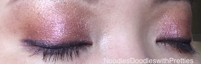
Wearing Chantecaille 15 Year Anniversary Trio and Cheek Shade in Bliss


I think there will be many who will think this is much too overpriced for how sheer the palette is. I have read that many have been disappointed with the more recent palettes because of the lack of pigment compared to the older palettes, and this palette will likely disappoint those people. Also, there is a high chance most would have dupes of all three of the shades (even from within the brand I feel).


Here’s a full palette swatch comparison of the Chantecaille with Chanel Les 4 Ombres in Poesie #234 (FOTD here) and CdP Eye Color Quad in Baby Universe #303 (FOTD here).


Poesie is easily the most metallic and bling-tiful. Baby Universe shares the same translucent beauty, but contains separate matte and shimmer shades.


Personally, I do really like this palette, and I’ve been reaching for it non-stop. It may not be the same level of love I give to the new Chanel or CdP quads, but I find this a very flattering and wearable glowly matte, and it feels good to have contributed to wildlife conservation in this way also.


The other LE item in this collection is the Cheek Shade in Bliss. If you brought this without swatching and hoped for a soft pastel pink, you may be in for a disappointment. On the skin, I'd describe Bliss as a bronzing blusher. There's a terra-cotta to the blusher that gives it a burnt orange tinge.


Wearing the butterfly and sea turtle shades on the eyes, Cheek Shade in Bliss and the Luminous Lip Gloss in Mulberry

The website describes the formula as giving ‘the most subtly convincing blush of color’ and I totally agree. It gives me an incredibly natural flush, that looks like I've just had a good workout. There is no shimmer that I can see, but the blush is far from matte. The light reflecting particles in there brings to my cheeks this lovely luminous glow.


It's not overly pigmented, and again there is a translucent sheerness to it, but it's easily buildable. I'm not familiar with Chantecaille's powder blushers (I have their cream ones which I love and really should do a post on) so I can't tell you how the measures up with the permanent line. The wear is great, lasting me all day, both the pigment and luminosity.


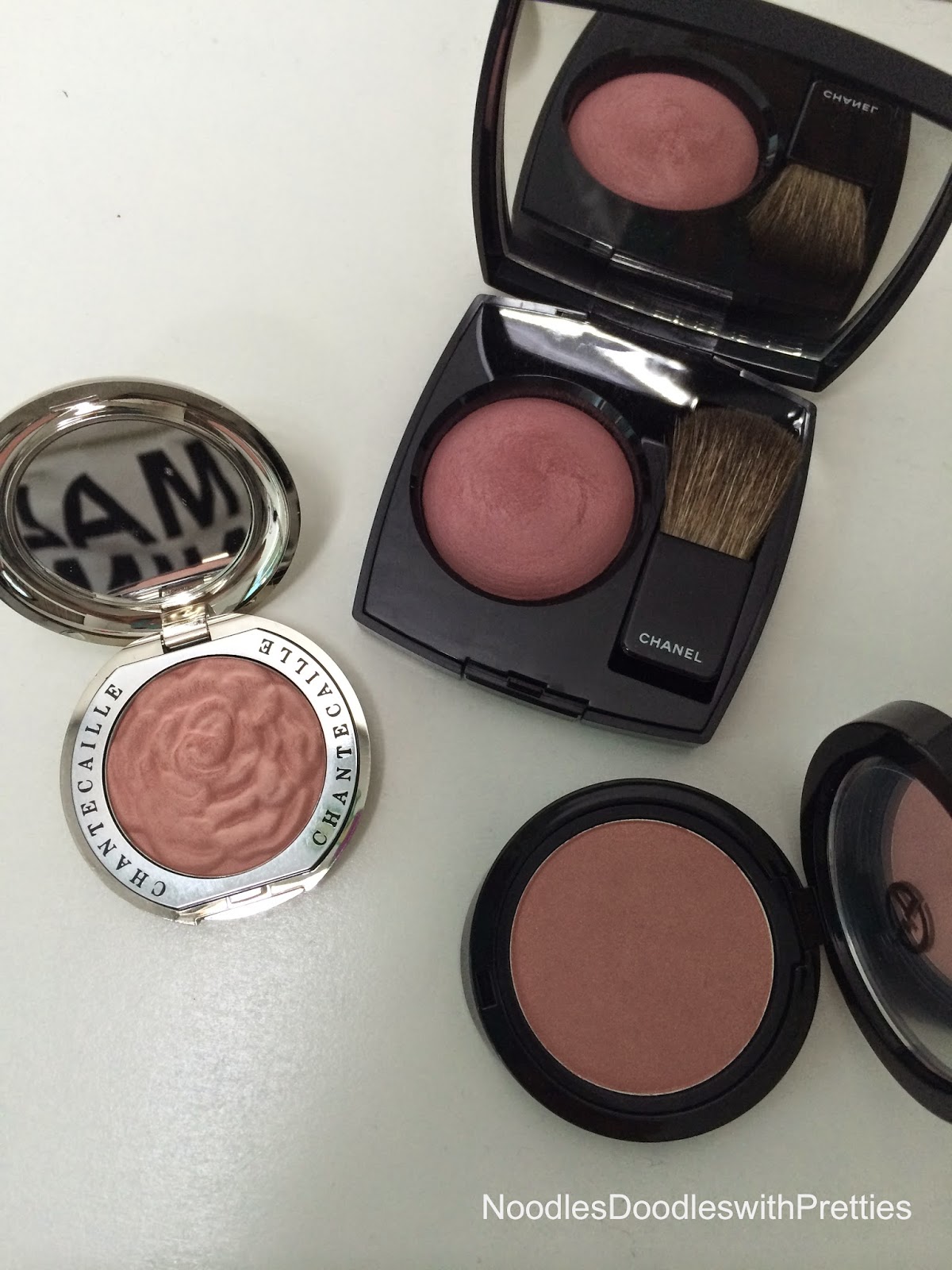
Above is a comparison of Bliss (left) with Chanel Joues Contraste in Innocence #160 (center / FOTD here) and Giorgio Armani Cheek Fabric in Daybreak #503 (right). Can you see how Bliss just molds to the skin so naturally with the dreaded swatch edge. It's in the same rose orange spirit as Daybreak, but the latter has much more visible shimmer. If I remember correctly all three blushers are LE.


I think natural translucency, glowly matte are my conclusions of the two limited edition items from Chantecaille’s 15 year anniversary collection. Both are right up my alley and I’m really enjoying using each of them.


From the collection I did also pick up two lip products, a Luminous Lip Gloss in Mulberry (an aubergine brown with gold, silver and green flecks of glitter, not merely shimmer, that can’t be felt on the lips) seen worn in the Bliss pic, and Hydra Chic Lipstick in Fairy Moss which hasn’t arrived at counter yet, so I’ll hope to do a lippy post later.


Have you picked up any of Chantecaille’s Anniversary items?


xx

Noodles :)


Monday, 7 July 2014

Etude House Play 101 Pencils Swatch and Comparisons


I was thoroughly intrigued about Etude House’s recently launched Play 101 Pencils when I saw the drool-triggering Pony use only these pencils to create a variety of amazing looks here, here and here.


Play 101 Pencils so far include 50 twist-up pencils with a sharpener embedded at the removable end. The finishes range from matte, shimmer, glitter to almost wet textures and a well balanced collection of colours. At the mid-high end of drug store prices, the quality and selection of these pencils are considerable, and when my local Etude House had their 30% off sale, I picked up a bunch of them. Today we’re going look at a few of the eyeliner/eyeshadow pencils. The blusher/lippy pencils will form another post.


These particular Play 101 pencils are all shimmers with micro glitters, the gel formula is buttery soft and glides on without patchiness. However, due to it's creamy softness, make sure you don't twist up too much product, as it may break off if you're not careful. One swipe gives good colour, but can be built up to a densely packed and intense pigmentation. I found these needed a little more time to set (nothing over a minute), but once set, it does not budge. My biggest issue with liner is smudging due to the shape of my hooded, mono-lidded eye, and these babies don't move one bit, even when I've got sweat rolling down my lids. It takes a tough rubbing with micellar to remove the hand swatches, so I’d say you’re better off with a bi-phase eye makeup remover to avoid damaging your eyes. In this batch, I found #31, 35 and 39 to have been the easiest to remove with micellar, but still one of the hardest to remove in the stash comparisons.

Let's swatch!

Left = 1 single swipe, right = intense swatch, bottom = blended out with finger.

First up are #31 a lilac taupe, #34 a purple aubergine and #35 a royal blue.


Next is #36 an electric blue, #38 a forrest green and #39 a khaki bronze. (apologies for shoddy #38 swatch, it broke off because I twisted up too much product, then I was too lazy to sharpen it)


Finally I have #43 an apricot pink, #45 an orange and #46 a pink orange.


Now on to some stash comparisons.


Taupe


L to R
  • EH Play 101 in #31 - Lilac taupe with silver micro glitter. Twist up.
  • Clinique Quicliner in Intense Truffle (10) - Shimmery cool toned taupe with grey hints. Twist up.
  • Chanel Stylo in Marron Glace (906) - Browner than the Clinique with silver micro glitter. Twist up.

Purple


  • EH Play 101 in #34 - Purple aubergine with brown tones and pinky purple micro glitter. Twist up.
  • Clinique Quickliner in Intense Aubergine (15) - Brown aubergine, subtle shimmer. Twist up.
  • By Terry Crayon Khol in Purple Label (5) - Very similar to the EH, only more black toned and slightly more muted on the glitter. Sharpened pencil.
  • YSL Eye Pencil in #11 - Almost matte deep black purple. Sharpened pencil.
  • Smashbox Limitless Eye Liner in Amethyst - Light red brown purple with subtle gold shimmer. Sharpened pencil.
  • Pupa Viva Carioca Long Lasting Eyeliner in #001 - Red brown aubergine with pink and gold micro glitter. Liquid liner.


Blue


  • EH Play 101 in #35 - Shimmery royal blue with electric blue micro glitter. Twist up.
  • YSL Eye Pencil in #13 - Subtly shimmery royal blue. Needed recoat after drydown to get this pigmentation. Sharpened pencil.
  • By Terry Crayon Khol in Blue Vision (4) - Deep almost black blue with hints of purple and grey shimmer. Sharpened pencil.
  • Guerlain Eye Pencil in Katy Navy (04) - Grey navy blue with silver micro glitter. Twist up.


Light Teal


  • EH Play 101 in #36 - Rich electric blue with silver glitter, colour can be intensified with 2nd coat. Twist up.
  • Nars Larger than Life Long-Wear in Abby Road - Shimmery light blue teal, more aqua than the EH. Twist up.
  • Chanel Stylo in Bleu Metallique (909) - Close in colour to EH, only slightly deeper. A shimmer without glitter. Twist up.
  • Clio Gelpresso in Jade Green (2) - Light blue teal with a hint of green shimmer. Needs second coat to get full opaque line. Twist up.


Greens


  • EH Play 101 in #38 - Olive forrest green, with gold and green micro glitter. Twist up.
  • Clinique Quickliner in Intense Peacock (14) - Bluer and less intense than the EH, is a shimmer without glitter, while the gel formula glided well, it needs a second coat to be patchless. Twist up.
  • Chantecaille 24hr Waterproof Eye Liner in Teal - Richer in intensity than Clinique, shimmer no glitter, Sharpened pencil.
  • By Terry Crayon Khol in Emeral Evasion (8) - Shimmery emerald green with gold hints. Sharpened pencil.
  • MAC Undercurrent - Base green colour is similar to the Chantecaille, but with added gold glitter. Sharpened pencil.
  • MUFE Aqua Eyes in 52L - Brighter and teal-er than Chantecaille, with a more obvious golden shimmer. Sharpened pencil.

Khaki Bronze


  • EH Play 101 in #39 - Bronzy green khaki with gold micro glitter. Twist up.
  • Clinique Quickliner in Intense Peridot (13) - Slightly more yellow/golden than the EH, a shimmer with sparse golden glitter. Twist up.
  • Chanel Stylo in Khaki Precieux (104) - Very similar to the Clinique, slightly more golden with pink shimmer hints. Twist up.
  • Chantecaille 24hr Waterproof Eyeliner in Oolong - Shimmery rose gold beige. Sharpened pencil
  • Bobbi Brown Perfectly Defined Gel Eyeliner in Scotch - Bronze with a hint of green khaki and gold micro glitter. Twist up
  • RBR Eye Khol in Calypso (030) - The most green khaki of the bunch, subtle shimmer with pink shimmer hints. Sharpened encil
  • Chanel Stylo in Santal (100) - Warmer than Bobbi Brown with pink shimmer. Twist up.


Apriocots, Pinks and Oranges


  • EH Play 101 in #43 - Shimmery apricot pink with silver micro glitter. Twist up.
  • EH Play 101 in #45 - Shimmery orange with sparse silver micro glitter. Twist up.
  • EH Play 101 in #46 - Shimmery pink orange with gold micro glitter. Twist up.
  • Solone Vivid Fantasy Smoody Pencil in ES-07 - Shimmery orange bronze. Twist up.
  • Clio Gelpresso in Beige Shine (1) - Shimmery apricot nude. Twist up.
  • By Terry Crayon Khol in Opaline Flash (6) - Shimmery cool silvery pink. Sharpened pencil.
  • Chanel Stylo in Amber Dore (911) -Very similar to EH #46, a tad tenser and bronze. Twist up.
  • Chanel Stylo in Or Rose (89) - Similar to EH #43, less pink. Twist up.
  • Armani Eye Pencil #04 - muted shimmery gold. Sharpened pencil.

Definitely need to clean house and purge a bunch!

If you happen to have access to Etude House, do check these pencils out, there are some close colour dupes of a few of the high end pencils, and in many cases, better in quality and wear.

xx
Noodles